Bạn lướt web thấy 1 số trang web bán hàng có nút gọi điện thoại rung lắc trông rất đẹp mắt? Bỗng nhiên, bạn nhận ra web của mình không có nút gọi điện như vậy? Ngay lập tức, bạn lên Google tìm kiếm cách tạo nút gọi điện rung lắc cho web và thấy bài viết này?
- [Flatsome theme] – Tạo menu xổ ngang trong Widget Area
- Hướng dẫn tạo thanh Float menu bám sát lề cho website WordPress
- Thay đổi giao diện thông tin chuyển khoản khi đặt hàng Woocommerce
Bạn đã tìm đúng bài viết rồi đó! Bài viết này, mình sẽ hướng dẫn cho bạn cách tạo nút gọi rung lắc đẹp cho web. Nó sẽ giúp gây chú ý cho khách hàng và kích thích họ bấm vào nút gọi trên web của bạn hơn.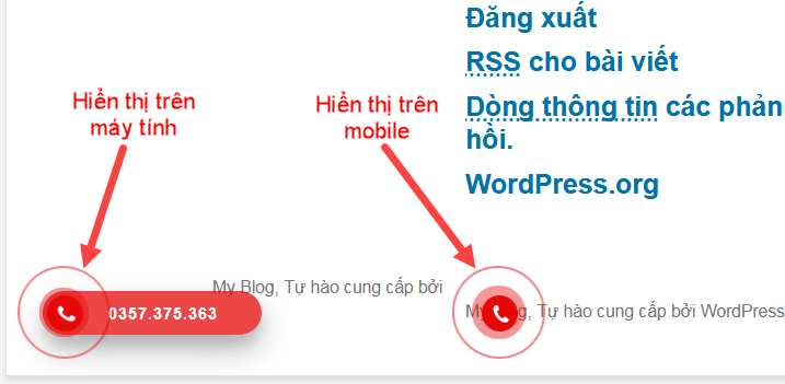
Với nút gọi này, khi khách hàng truy cập trên máy tính thì họ sẽ nhìn thấy số hotline và có thể tự bấm số để gọi cho bạn. Còn nếu khách truy cập bằng mobile thì họ chỉ cần click vào là gọi cho bạn được luôn.
OK. Dưới đây mình sẽ hướng dẫn bạn tạo nút gọi điện thoại cho web theo 2 cách. Đó là dùng code và dùng plugin.
Code chèn nút gọi điện rung lắc cho website
Đây là cách thứ nhất, dành cho bạn nào biết về code có thể dùng code HTML và CSS dưới đây để tạo nút gọi điện thoại.
Chèn code sau vào phần footer của web.
<div class="hotline-phone-ring-wrap">
	<div class="hotline-phone-ring">
		<div class="hotline-phone-ring-circle"></div>
		<div class="hotline-phone-ring-circle-fill"></div>
		<div class="hotline-phone-ring-img-circle">
		<a href="tel:0988488263" class="pps-btn-img">
			<img src="https://isharevn.net/wp-content/uploads/2021/05/icon-call-nh.png" alt="Gọi điện thoại" width="50">
		</a>
		</div>
	</div>
	<div class="hotline-bar">
		<a href="tel:0988488263">
			<span class="text-hotline">0988.488.263</span>
		</a>
	</div>
</div>
Chèn code sau vào CSS của theme (với theme Flatsome các bạn vào Theme => Avanced => CSS).
.hotline-phone-ring-wrap {
  position: fixed;
  bottom: 0;
  left: 0;
  z-index: 999999;
}
.hotline-phone-ring {
  position: relative;
  visibility: visible;
  background-color: transparent;
  width: 110px;
  height: 110px;
  cursor: pointer;
  z-index: 11;
  -webkit-backface-visibility: hidden;
  -webkit-transform: translateZ(0);
  transition: visibility .5s;
  left: 0;
  bottom: 0;
  display: block;
}
.hotline-phone-ring-circle {
	width: 85px;
  height: 85px;
  top: 10px;
  left: 10px;
  position: absolute;
  background-color: transparent;
  border-radius: 100%;
  border: 2px solid #e60808;
  -webkit-animation: phonering-alo-circle-anim 1.2s infinite ease-in-out;
  animation: phonering-alo-circle-anim 1.2s infinite ease-in-out;
  transition: all .5s;
  -webkit-transform-origin: 50% 50%;
  -ms-transform-origin: 50% 50%;
  transform-origin: 50% 50%;
  opacity: 0.5;
}
.hotline-phone-ring-circle-fill {
	width: 55px;
  height: 55px;
  top: 25px;
  left: 25px;
  position: absolute;
  background-color: rgba(230, 8, 8, 0.7);
  border-radius: 100%;
  border: 2px solid transparent;
  -webkit-animation: phonering-alo-circle-fill-anim 2.3s infinite ease-in-out;
  animation: phonering-alo-circle-fill-anim 2.3s infinite ease-in-out;
  transition: all .5s;
  -webkit-transform-origin: 50% 50%;
  -ms-transform-origin: 50% 50%;
  transform-origin: 50% 50%;
}
.hotline-phone-ring-img-circle {
	background-color: #e60808;
	width: 33px;
  height: 33px;
  top: 37px;
  left: 37px;
  position: absolute;
  background-size: 20px;
  border-radius: 100%;
  border: 2px solid transparent;
  -webkit-animation: phonering-alo-circle-img-anim 1s infinite ease-in-out;
  animation: phonering-alo-circle-img-anim 1s infinite ease-in-out;
  -webkit-transform-origin: 50% 50%;
  -ms-transform-origin: 50% 50%;
  transform-origin: 50% 50%;
  display: -webkit-box;
  display: -webkit-flex;
  display: -ms-flexbox;
  display: flex;
  align-items: center;
  justify-content: center;
}
.hotline-phone-ring-img-circle .pps-btn-img {
	display: -webkit-box;
  display: -webkit-flex;
  display: -ms-flexbox;
  display: flex;
}
.hotline-phone-ring-img-circle .pps-btn-img img {
	width: 20px;
	height: 20px;
}
.hotline-bar {
  position: absolute;
  background: rgba(230, 8, 8, 0.75);
  height: 40px;
  width: 180px;
  line-height: 40px;
  border-radius: 3px;
  padding: 0 10px;
  background-size: 100%;
  cursor: pointer;
  transition: all 0.8s;
  -webkit-transition: all 0.8s;
  z-index: 9;
  box-shadow: 0 14px 28px rgba(0, 0, 0, 0.25), 0 10px 10px rgba(0, 0, 0, 0.1);
  border-radius: 50px !important;
  /* width: 175px !important; */
  left: 33px;
  bottom: 37px;
}
.hotline-bar > a {
  color: #fff;
  text-decoration: none;
  font-size: 15px;
  font-weight: bold;
  text-indent: 50px;
  display: block;
  letter-spacing: 1px;
  line-height: 40px;
  font-family: Arial;
}
.hotline-bar > a:hover,
.hotline-bar > a:active {
  color: #fff;
}
@-webkit-keyframes phonering-alo-circle-anim {
  0% {
    -webkit-transform: rotate(0) scale(0.5) skew(1deg);
    -webkit-opacity: 0.1;
  }
  30% {
    -webkit-transform: rotate(0) scale(0.7) skew(1deg);
    -webkit-opacity: 0.5;
  }
  100% {
    -webkit-transform: rotate(0) scale(1) skew(1deg);
    -webkit-opacity: 0.1;
  }
}
@-webkit-keyframes phonering-alo-circle-fill-anim {
  0% {
    -webkit-transform: rotate(0) scale(0.7) skew(1deg);
    opacity: 0.6;
  }
  50% {
    -webkit-transform: rotate(0) scale(1) skew(1deg);
    opacity: 0.6;
  }
  100% {
    -webkit-transform: rotate(0) scale(0.7) skew(1deg);
    opacity: 0.6;
  }
}
@-webkit-keyframes phonering-alo-circle-img-anim {
  0% {
    -webkit-transform: rotate(0) scale(1) skew(1deg);
  }
  10% {
    -webkit-transform: rotate(-25deg) scale(1) skew(1deg);
  }
  20% {
    -webkit-transform: rotate(25deg) scale(1) skew(1deg);
  }
  30% {
    -webkit-transform: rotate(-25deg) scale(1) skew(1deg);
  }
  40% {
    -webkit-transform: rotate(25deg) scale(1) skew(1deg);
  }
  50% {
    -webkit-transform: rotate(0) scale(1) skew(1deg);
  }
  100% {
    -webkit-transform: rotate(0) scale(1) skew(1deg);
  }
}
@media (max-width: 768px) {
  .hotline-bar {
    display: none;
  }
}