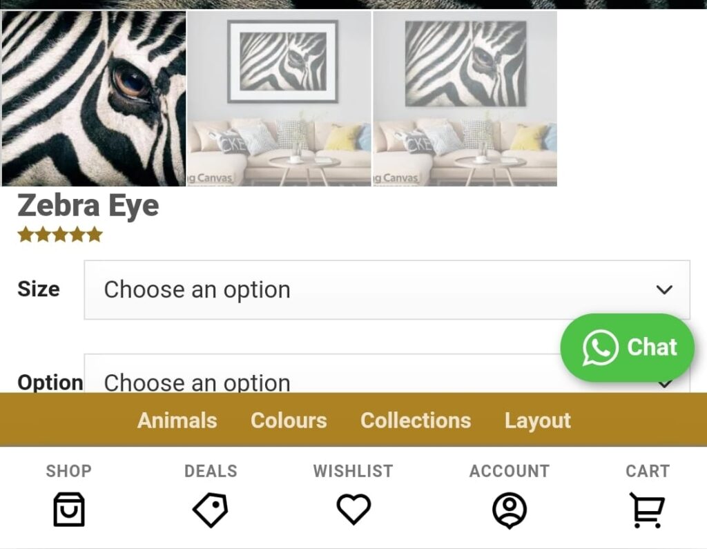
Hôm nay, isharevn xin chia sẻ với các bạn một mẫu sticky Footer dành cho theme Flatsome. Các bạn lưu ý khi sử dụng nhé, vì nhiều button quá sẽ rối mắt đó, vì còn call action Gọi điện, Zalo, Messenger,….
- Hướng dẫn tạo nút gọi điện rung lắc cho website cực đẹp trên PC và mobile
- [Flatsome theme] – Tạo menu xổ ngang trong Widget Area
- Hướng dẫn tạo thanh Float menu bám sát lề cho website WordPress

1. UX shortcode
Tạo mới UX Block và copy đoạn code dưới đây.
[ux_stack distribute="around"]
[featured_box img="https://isharevn.net/wp-content/uploads/2021/05/shopping-bag-line.png" img_width="32" pos="center" title_small="Shop" margin="0 0px 0px 0px" link="#"]
[gap height="0px"]
[/featured_box]
[featured_box img="https://isharevn.net/wp-content/uploads/2021/05/percent-line.png" img_width="32" pos="center" title_small="Deals" margin="0 0px 0px 0px" link="#"]
[gap height="0px"]
[/featured_box]
[featured_box img="https://isharevn.net/wp-content/uploads/2021/05/account-circle-line.png" img_width="32" pos="center" title_small="Account" margin="0 0px 0px 0px" link="#"]
[gap height="0px"]
[/featured_box]
[featured_box img="https://isharevn.net/wp-content/uploads/2021/05/list-unordered.png" img_width="32" pos="center" title_small="Cart" margin="0 0px 0px 0px" link="#"]
[gap height="0px"]
[/featured_box]
[/ux_stack]
[/col]
[/row]
Sau đó, các bạn vào footer chọn UX Block nhé. Có thể các bạn chọn hiển thị onlymobile cho block.
2. Thêm CSS
Các bạn truy cập Flatsome => Advanced => CSS
.sticky-mobile-menu {
    position: fixed;
    left: 0;
    bottom: 0;
    z-index: 999;
    -webkit-box-shadow: 0px -8px 29px -12px rgba(0,0,0,0.2);
    box-shadow: 0px -8px 29px -12px rgba(0,0,0,0.2);
}

.sticky-mobile-menu .icon-box-center .icon-box-img {
    margin: 0 auto 4px;
}

@media (max-width: 549px) {
#footer {
    margin-bottom: 90px;
}
}